ARCHI Akwarystyka - Brand Identity
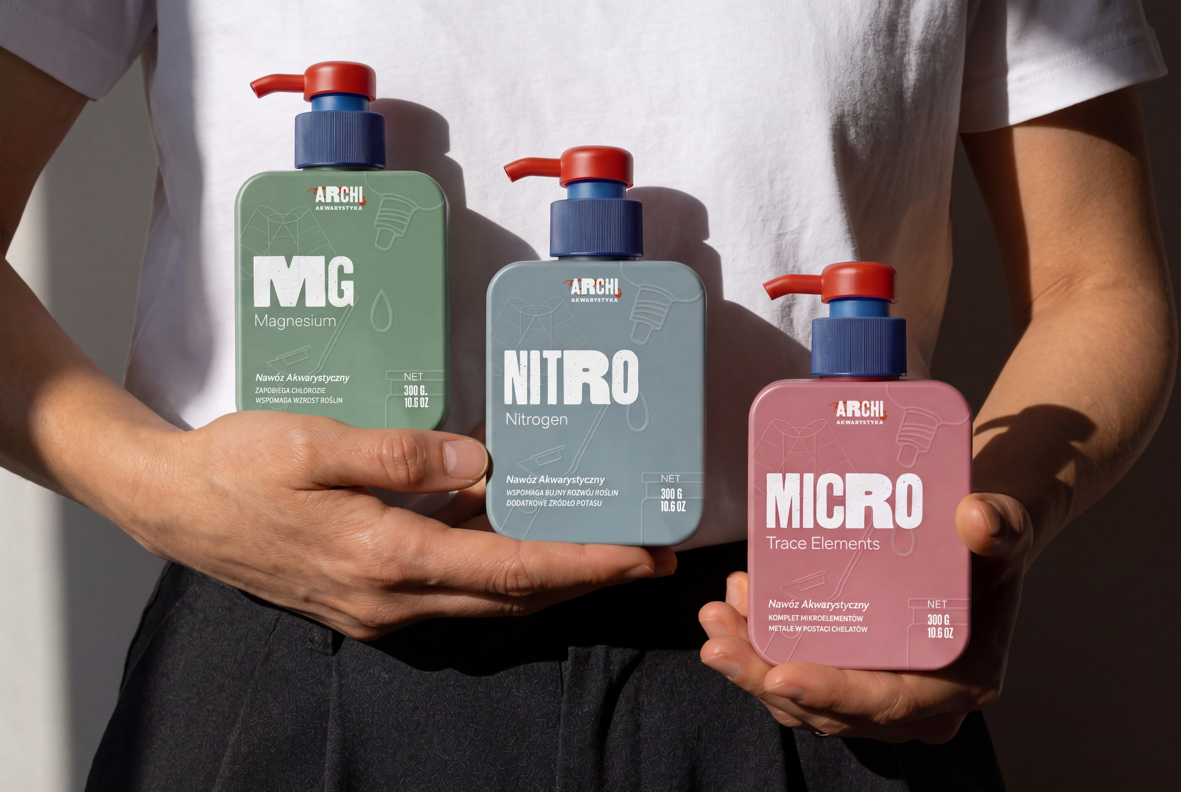
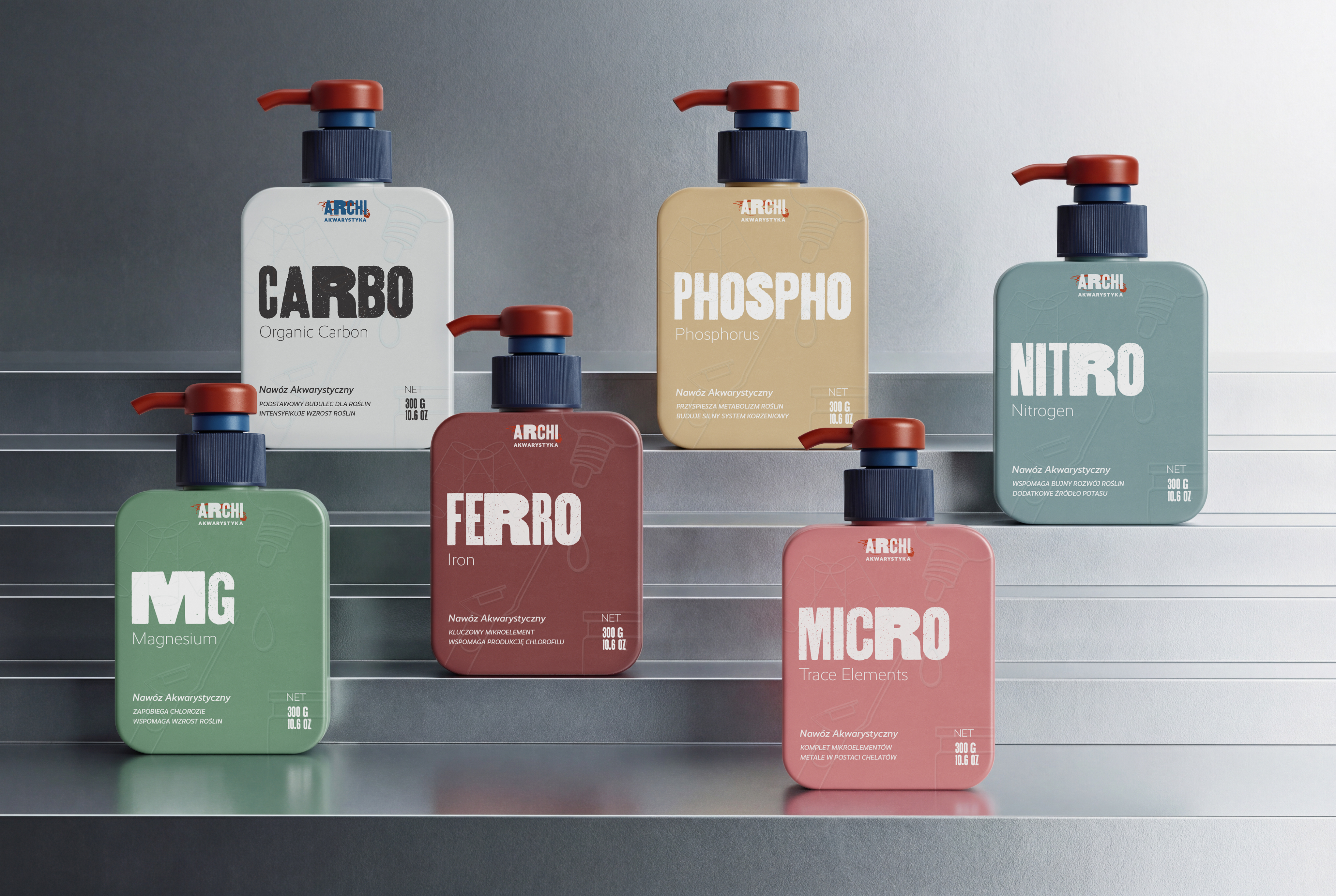
Visual Identity for ARCHI Akwarystyka: crafting a unique look for a brand specializing in professional fertilizers and freshwater aquarium services. The goal: ditch industry clichés and create a distinct, exclusive vibe.
Nature's Architecture
About ARCHI
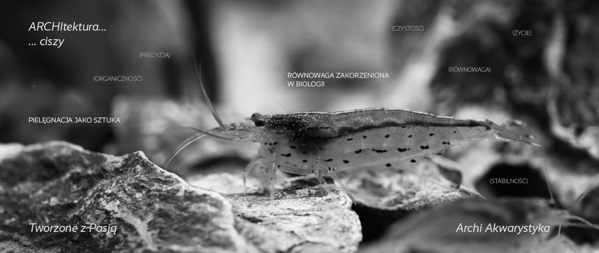
ARCHI goes beyond aquarium care—it's a passion blending precision, biology, and underwater beauty. Each formula and setup is perfectly balanced to ensure natural clarity and biological stability.
Logo Design
The ARCHI logo captures nature's raw beauty with bold, textured typography symbolizing strength and authenticity. Organic letterforms meet dynamic aquatic elements for a lively, expert feel.
Behind the logo's silhouette lies the vibrant energy of underwater life. ARCHI bridges nature and expertise—bold, organic, and full of life—bringing the underwater spirit to the surface.
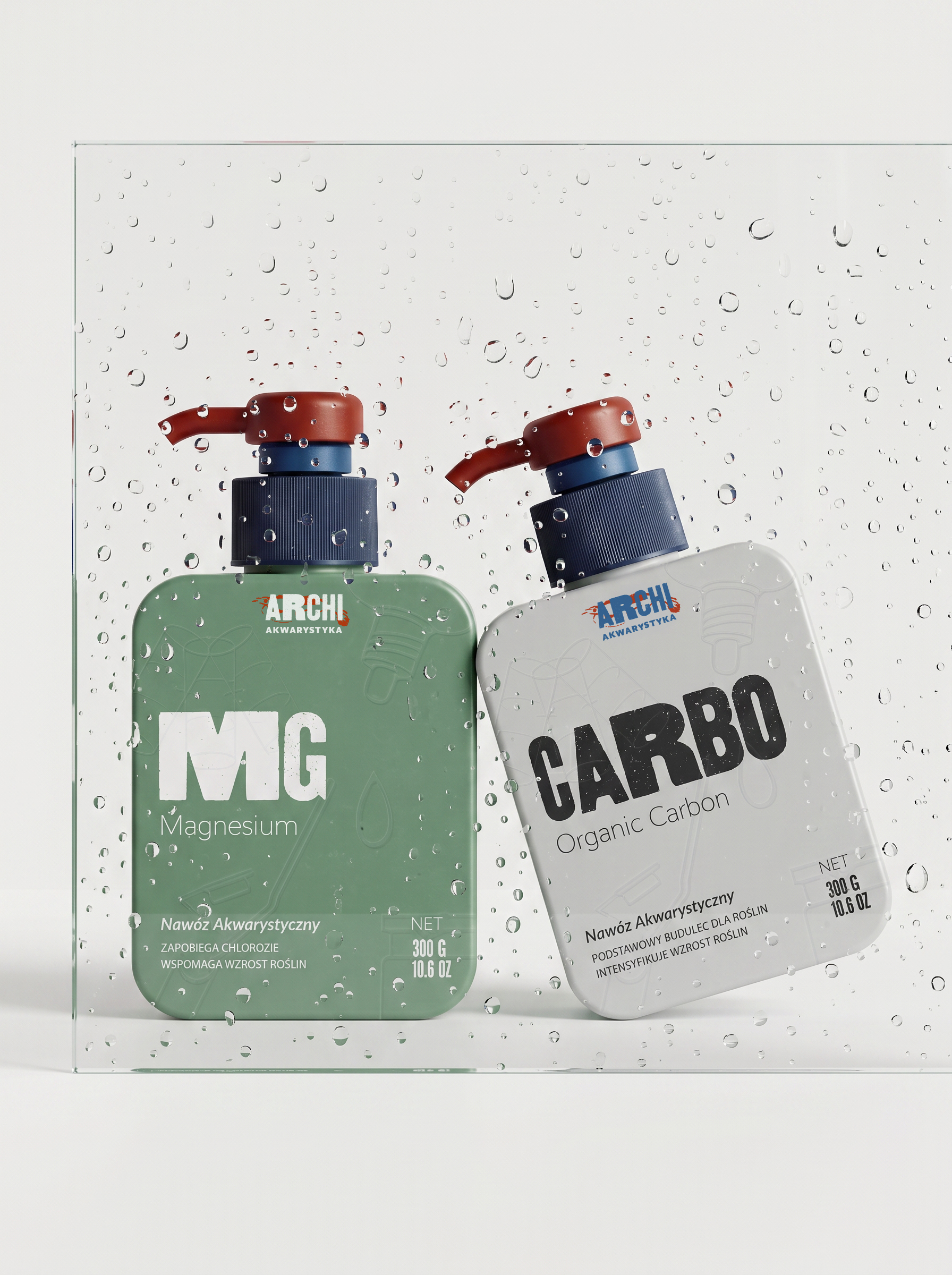
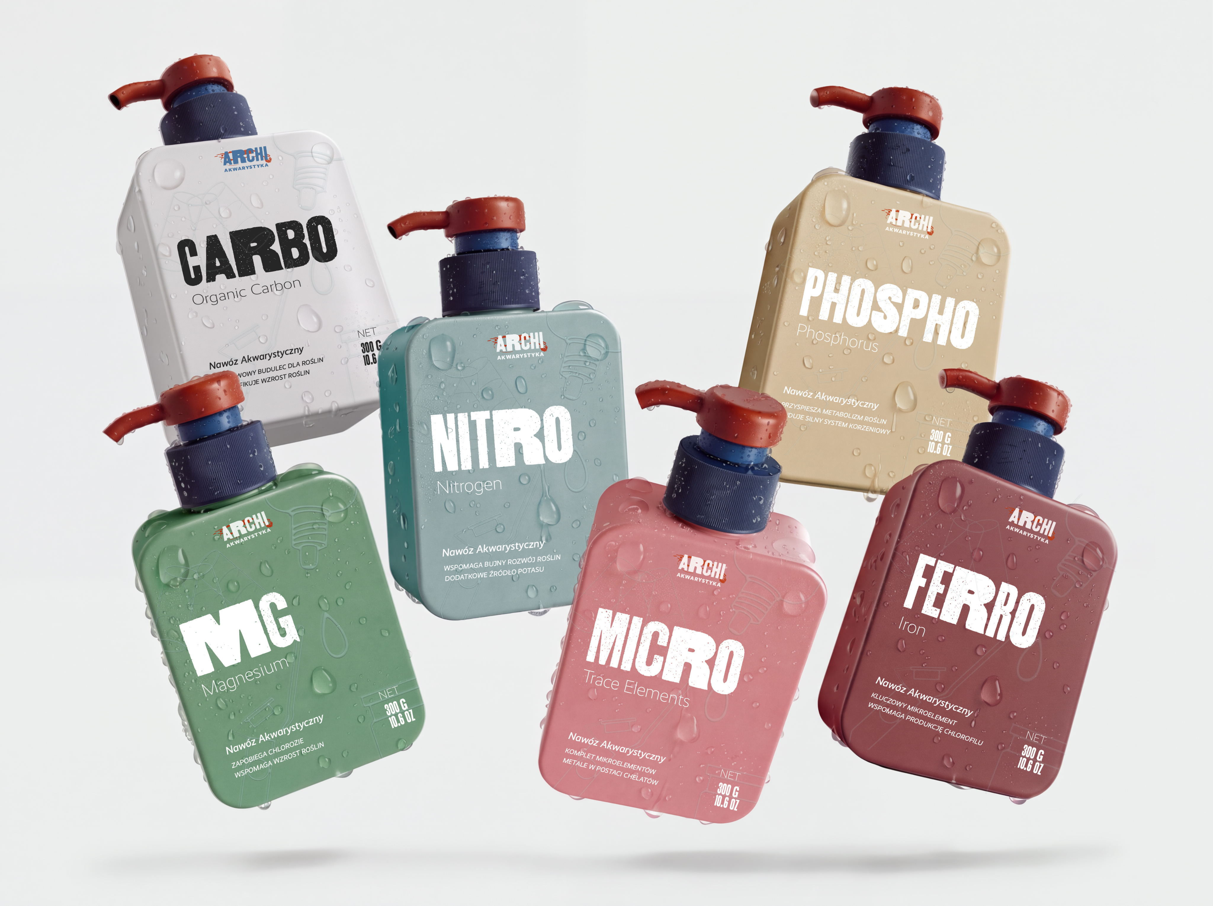
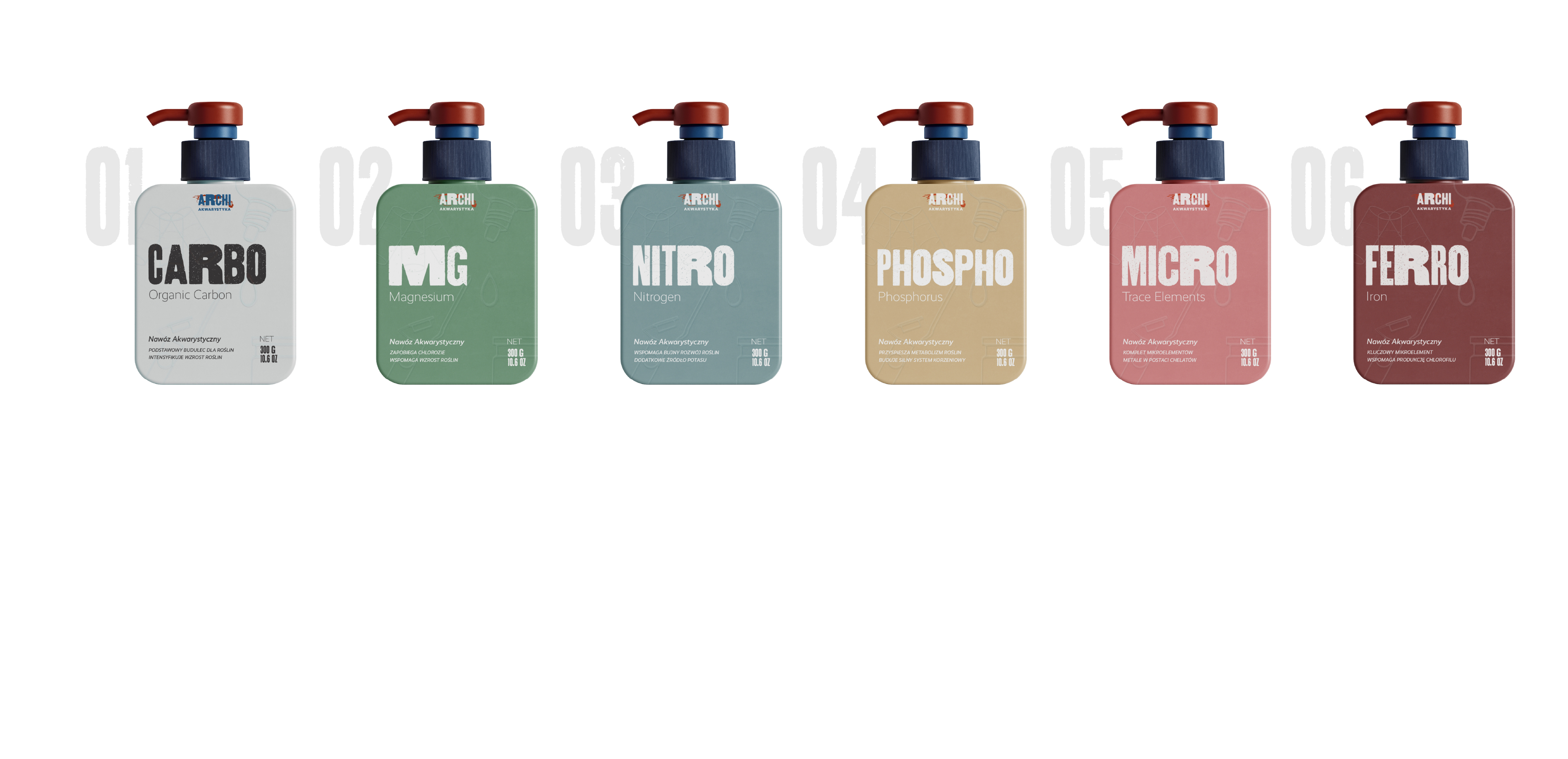
The Collection
Brochure
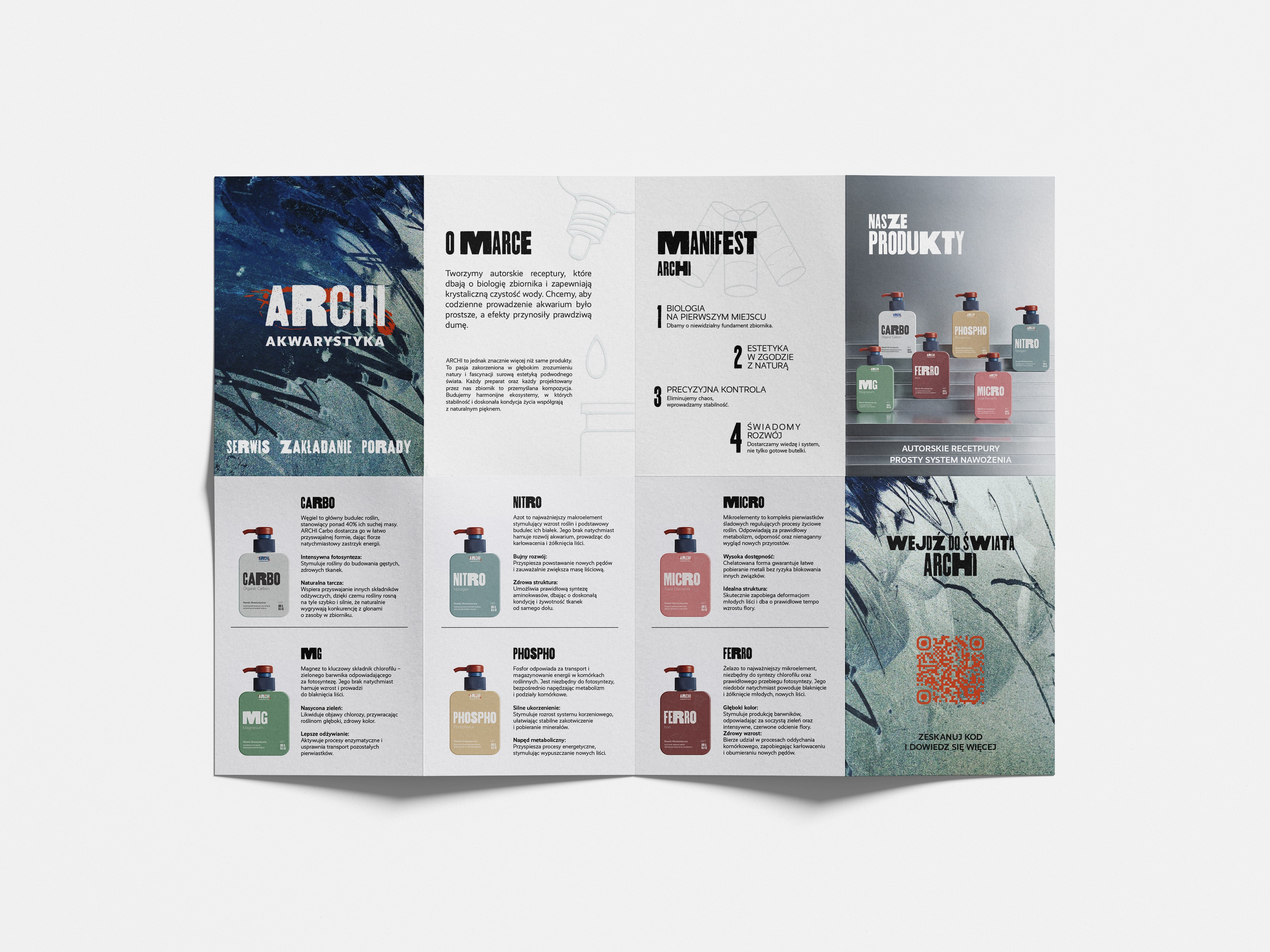
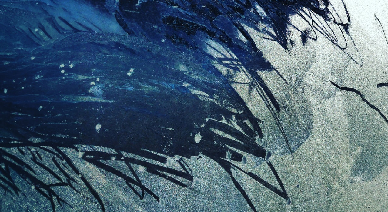
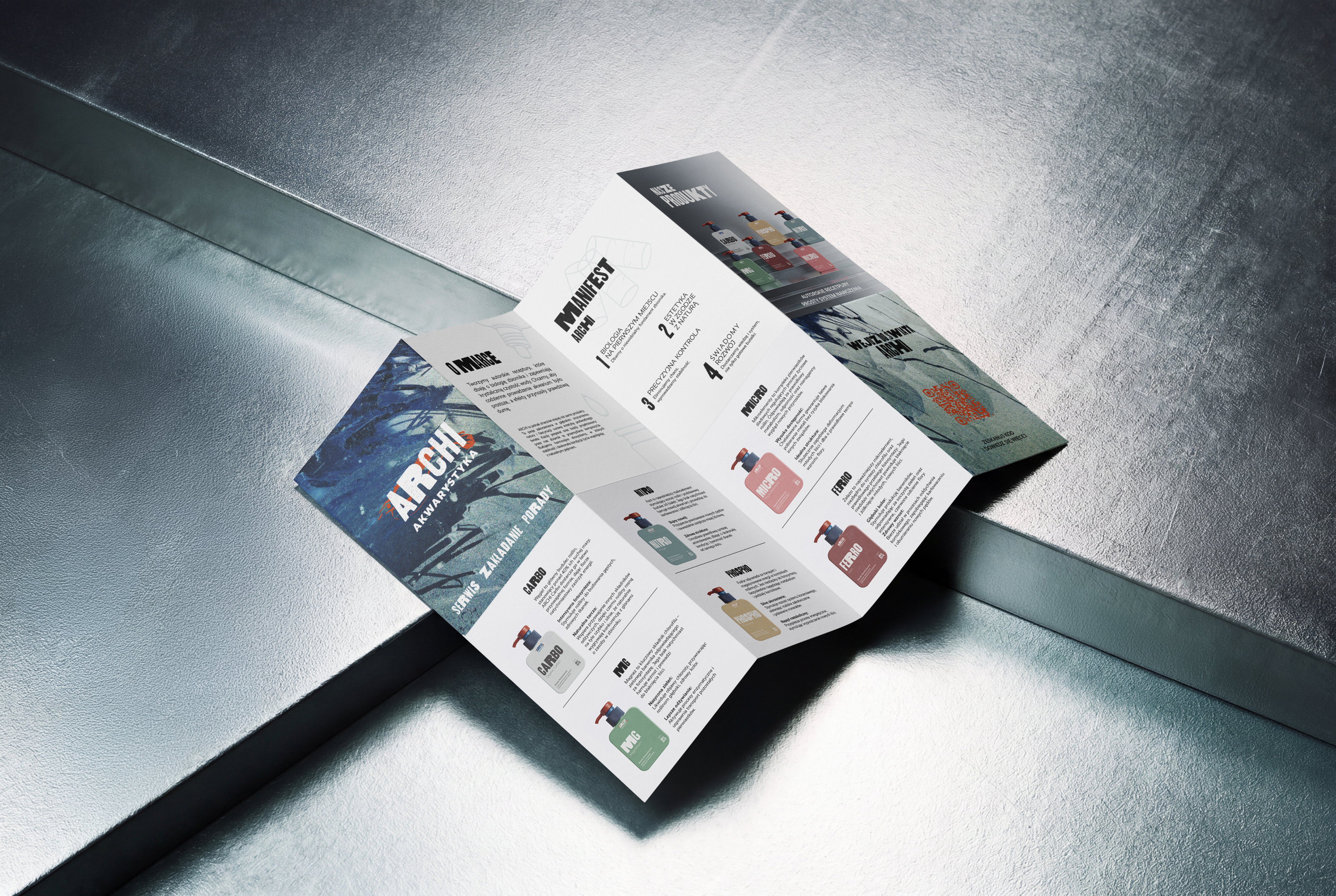
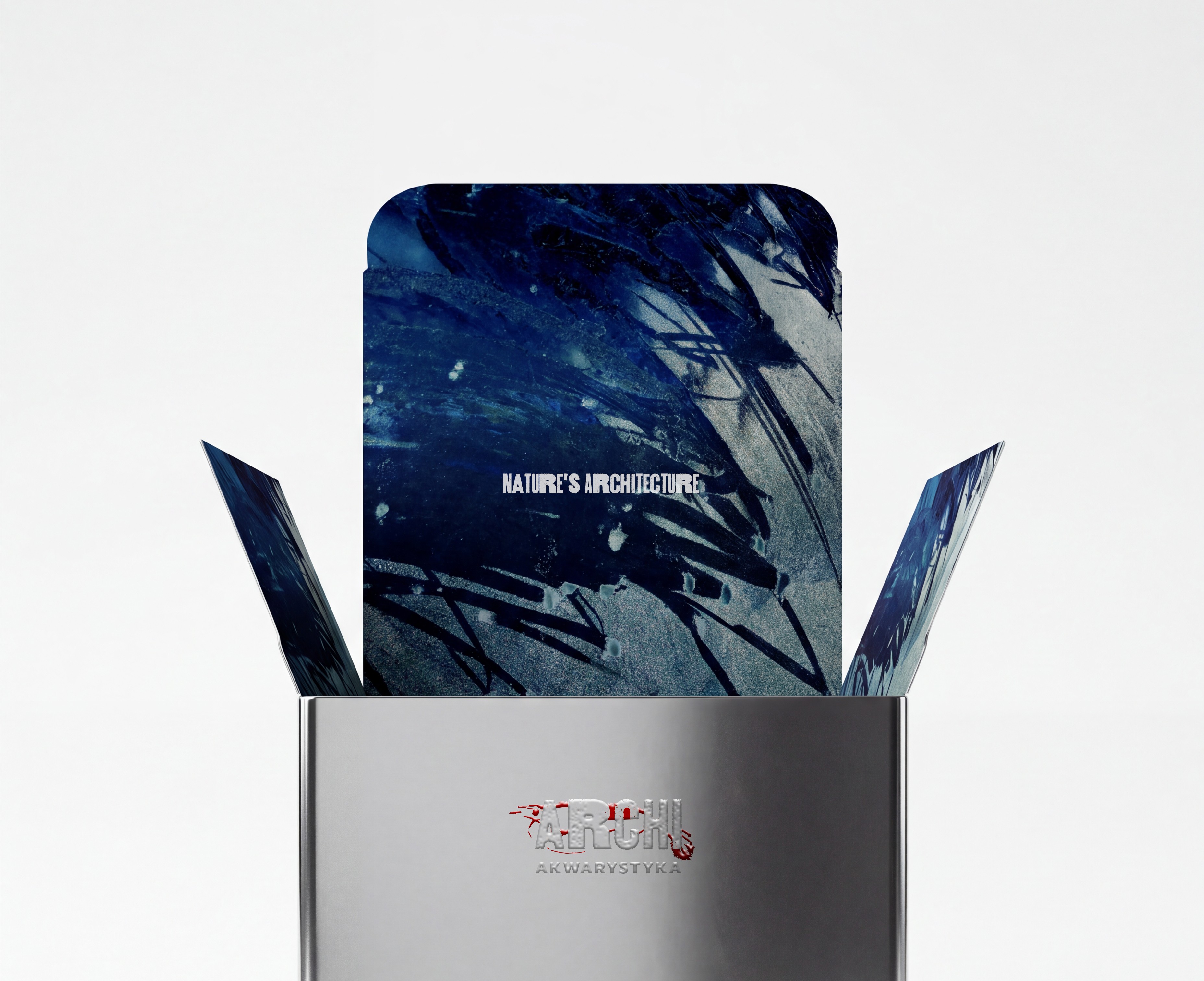
Each brochure panel highlights a vivid aspect of aquatic life—not subtly, but with bold textures and strong typography paired with modern branding.
Business Card
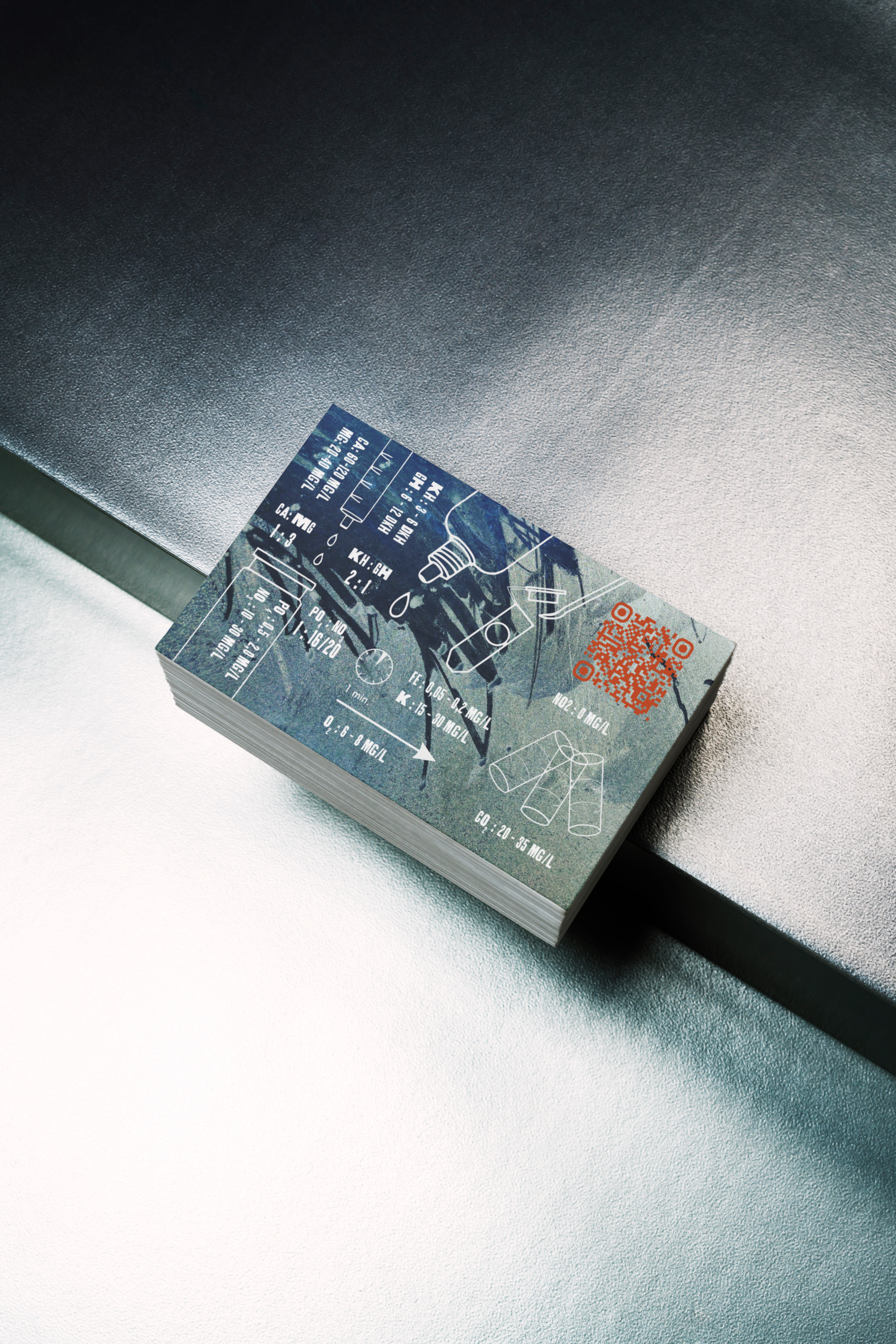
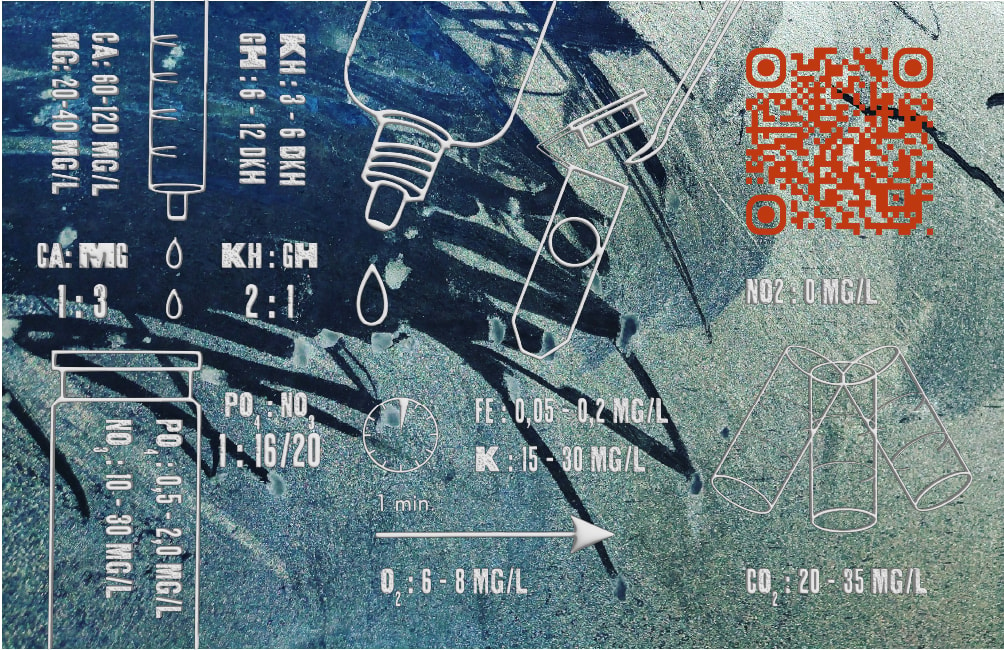
The business card's back doubles as a handy reference for water testing, showing golden ratios and key micro and macro elements. It transforms a promo item into a must-have guide for hobbyists.
ARCHI Akwarystyka - Brand Identity
Visual Identity for ARCHI Akwarystyka: crafting a unique look for a brand specializing in professional fertilizers and freshwater aquarium services. The goal: ditch industry clichés and create a distinct, exclusive vibe.
Nature's Architecture
About ARCHI
ARCHI goes beyond aquarium care—it's a passion blending precision, biology, and underwater beauty. Each formula and setup is perfectly balanced to ensure natural clarity and biological stability.
Logo Design
The ARCHI logo captures nature's raw beauty with bold, textured typography symbolizing strength and authenticity. Organic letterforms meet dynamic aquatic elements for a lively, expert feel.
Behind the logo's silhouette lies the vibrant energy of underwater life. ARCHI bridges nature and expertise—bold, organic, and full of life—bringing the underwater spirit to the surface.
The Collection
Brochure
Each brochure panel highlights a vivid aspect of aquatic life—not subtly, but with bold textures and strong typography paired with modern branding.
Business Card
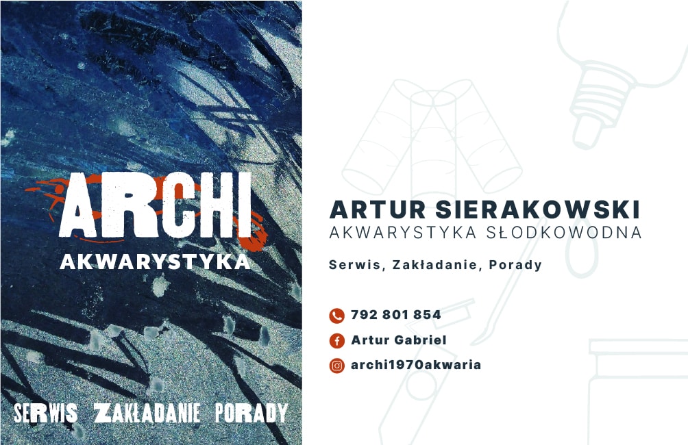
The business card's back doubles as a handy reference for water testing, showing golden ratios and key micro and macro elements. It transforms a promo item into a must-have guide for hobbyists.
Aleksandra Strychalska
ARCHI Akwarystyka - Brand Identity
Visual Identity for ARCHI Akwarystyka: crafting a unique look for a brand specializing in professional fertilizers and freshwater aquarium services. The goal: ditch industry clichés and create a distinct, exclusive vibe.
Nature's Architecture
About ARCHI
ARCHI goes beyond aquarium care—it's a passion blending precision, biology, and underwater beauty. Each formula and setup is perfectly balanced to ensure natural clarity and biological stability.
Logo Design
The ARCHI logo captures nature's raw beauty with bold, textured typography symbolizing strength and authenticity. Organic letterforms meet dynamic aquatic elements for a lively, expert feel.
Behind the logo's silhouette lies the vibrant energy of underwater life. ARCHI bridges nature and expertise—bold, organic, and full of life—bringing the underwater spirit to the surface.
The Collection
Brochure
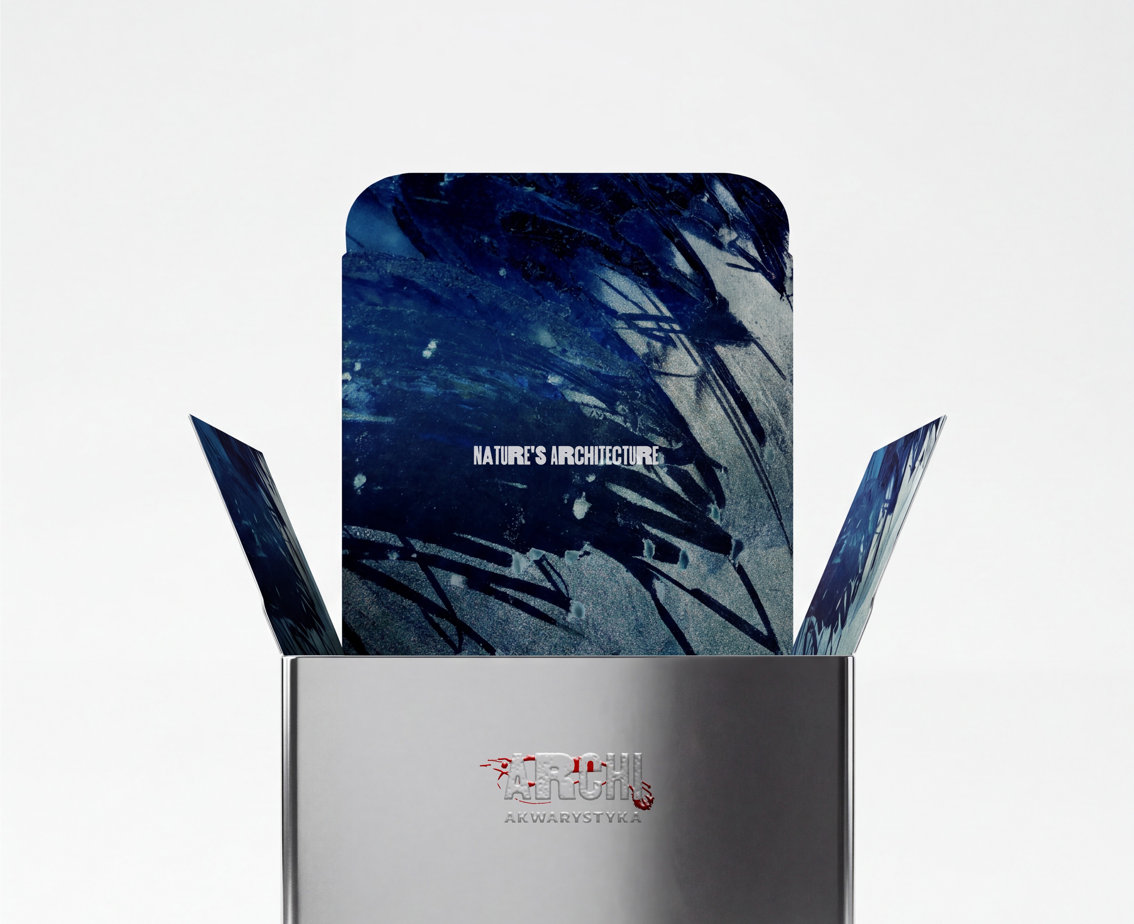
Each brochure panel highlights a vivid aspect of aquatic life—not subtly, but with bold textures and strong typography paired with modern branding.
Business Card
The business card's back doubles as a handy reference for water testing, showing golden ratios and key micro and macro elements. It transforms a promo item into a must-have guide for hobbyists.
Aleksandra Strychalska